Image may be NSFW.
Clik here to view. Back in December 2011, I asked whether or not the TTC is priciest transit system in North America. The answer at that time was "yes," at least amongst big-city, single-fare, bus-and-rail systems.
Since then, the lagging impact of the Long Recession has caught up with many US public transit systems, slamming them with large fare increases and service reductions. While generously funded compared to the TTC, many of these systems rely much more directly on sales, property and payroll tax revenue for these extra funds and their operating budgets are therefore much more sensitive to shortfalls during economic downturns. (Capital projects are another story, with billions in federal funding that Canadian cities can only drool at).
As a result of the economy, and despite solid ridership, cities such as Dallas, Chicago and Boston saw fare increases from 15% to 23% while other cities struggled with threats of massive service cuts. In other words, 2012 was not kind to many transit systems.
So where does that leave the TTC compared to its peers as we enter 2013? With its more stable economy, Toronto was spared some of the funding crises that hit US cities (Rob Ford histrionics notwithstanding), although soaring transit use is putting increasing pressure on the system. And of course the TTC did see a fare increase kick in on January 1st, pushing the monthly Metropass up to $126. How does the comparison shake out?
The short and unfortunate answer is that while the gap has narrowed some, Toronto has defended its title and remains the Most Expensive City for Transit in North America (see fine print below).
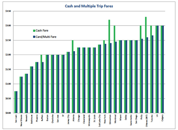
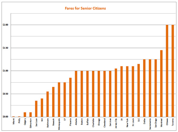
While many transit systems have raised cash and multiple-trip fares, the TTC remains in the top tier for base fares. Senior fares are much more expensive in Toronto than all other cities except Ottawa, which offers a low cost monthly senior's pass (and free Wedesdays!) to compensate. Except for a pilot program on the St. Clair streetcar, the TTC has no two-direction transfers or reduced fare zone for those who only take short trips, harsh treatment in a city teeming with downtown residents.
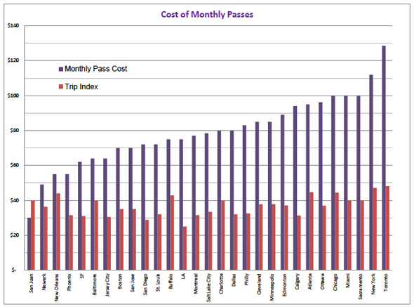
Most damaging, the TTC has by far the most expensive monthly pass, one that requires a stunning 48 trips to pay for itself. This equates to having to commute all 22 work days in a month, plus twice on the weekends, while never taking vacation or being sick. No other city has such a high index. Even New York, where levels of car ownership are low and a certain amount of non-work-related transit use can be expected, has a lower Trip Index (47).
Something is clearly wrong about the price of public transit in Toronto. The reasons are well known, and the problems are only likely to get worse. (See: Metrolinx, Presto, Ford, no Ford, Big Move, etc.). What will it take to bring the cost of riding the TTC more in line with the rest of the continent? Can anything be done to keep the Red Rocket from becoming the Red Ripoff? For the health of the city, let's hope so.
COMPARATIVE FARE CHART
Image may be NSFW.
Clik here to view. Image may be NSFW.
Clik here to view. Image may be NSFW.
Clik here to view. THE FINE PRINT (i.e. stop reading if you're already convinced)
- I'm no Nate Silver, so this analysis was rather basic. I simply collected fare data from every big-city single-fare integrated public transit system I could find, all twenty-nine of them. Note that this set does not include zone-based systems such as Washington DC, Pittsburgh, Houston, Denver, Portland, Seattle and Vancouver. These are apples-to-oranges when compared to single fare-zone systems. They are typically still cheaper than the TTC for those living within city limits but at GO Transit-like fare levels for their more distant suburban commuters. Perhaps in another post I will try to level one of these vs Toronto in a discussion about future fare structures in the coming age of Presto, but for today's post they are ignored.
- Although the title of this post mentions "North America", this is meant in the local dialect of "we really mean just Canada and the US but are tired of saying that explicitly all the time". Obviously adding Mexico to the discussion would not help the TTC's apparent costliness, given Mexico City's 23-cent subway fares.
- The Base Fare is the cash, single-trip fare, used mostly by tourists and infrequent users. It is the easiest to compare but also the least relevant to commuters and quickly falling out of use in the era of smartcards.
- More interesting is what I call the "Multiple-trip Fare". This is meant to reflect the lowest possible cost for a paid trip, i.e. what a frequent pay-per-ride user would pay because they buy bulk tickets or tokens or get a smart-card discount. Some cities offer a lower price for frequent users using these structures; some do not.
- Certain cities (notably Ottawa, Edmonton, Calgary, Dallas, Minneapolis, San Francisco) use a 90 minute or 2-hour fare that allows stopovers and transfers in either direction. This is tremendously convenient for downtown residents, who otherwise overpay in a single-fare-zone system, as they can take short trips to complete an entire errand on one fare within the time window. It is not important to commuters though, so I ignore it here.
- A few cities in the Base Fare chart (notably Calgary and Salt Lake City) have a Free or reduced-fare downtown zone. These are ignored in this study but would obviously have a huge impact on a city with as many downtown residents, students, workers (and, to be fair, homeless people) as Toronto. However, "Fareless Squares" are not without their issues: Seattle and Portland eliminated theirs in 2012 to fill budget holes.
- Minneapolis offers reduced fares outside of rush hour. While a boon to livability, these types of fares are ignored here.
- Student fares are far too varied in format and age limits to easily compare, but all cities offer some sort of senior fare that is more easily leveled. Calgary and Edmonton have an usual setup where seniors pay $55 for a yearly pass ($15 for low-income seniors in Calgary), so I set their senior per-trip cost at near zero. Miami and Philadelphia actually let seniors ride free! Ottawa seniors can get a $39 monthly pass but for this study I used their senior single-trip cash fare.
- Transfers are the hardest component to account for. Most systems are integrated, but some (notably LA, Miami and Philadelphia) still require paid transfers every time you change buses or trains, an anachronism from the private transit systems of 75 years ago. For this year's study I decided to include the cost of one transfer in the base fare for these cities. This spikes the cost by 25% (Miami) to 100% (LA) but is probably realistic since few people live on the exact bus or rail line that takes them from home to work. But take the base fare numbers for these cities with a grain of salt since they would indeed be lower if a transfer was not needed.
- Where different prices for bus vs subway do still exist, as in Boston or St. Louis, the rail fare was used. For Ottawa the bus price was used as this city is unique in having a full BRT trunk line. (The small demonstration rail line is actually less expensive to ride but carries only 2% of daily ridership and is therefore ignored).
- Day and Weekly passes are too varied to compare, and not all cities offer all formats, but Monthly passes are a common standard. While these do differ between cities in terms of whether they are transferrable, 30 or 31 days, or when the month actually starts, they are all considered equivalent for the purpose of this study. The unique Metropass Discount Program, which lowers the cost of a TTC metropass for an annual subscription, is ignored here as it is not the common scenario.
- Also on the Monthly chart you will see what I am calling the Trip Index, which is the cost of a monthly pass divided by the Multiple Trip fare price. This is the tipping point that helps frequent users (such as adult students and workers) decide if they should get a monthly pass or just pay the discounted price each ride using a smartcard/tokens/tickets... The average month has about 22 working days, so after factoring in vacations and sick days the average person might by a monthly pass based on commuting alone if the Trip Index is in the low 40s. Cities with TI's in the 30s are clearly nudging frequent riders towards passes, which in turn leads to increased public transit use as it makes transit effectively free on evenings and weekends. It is a very bad sign for commuters when this number rises above 44.
- In the 2011 comparison, much hay was made in the comments section over the cost of GTA suburban transit systems such as York VIVA vs the TTC. This post is about a big-city, rail-oriented, continent-wide transit comparison and no suburban bus systems were included, nor should they be. Suburban systems will often cost more than their peers in a large city due to issues of land use planning, density, car ownership, etc. They also tend to take their lead from their big-city cousins because they are subject to similar funding and expense parameters. And it is likely the suburban Toronto systems will eventually all be absorbed into a single GTA fare structure just as has happened dozens of other cities with regional transit authorities. So they are ignored here, disturbing as their high prices may be.
- Exchange rate assumed to be $1 US = $1 Cdn. This has been reasonably true over the past few years and a difference of a few cents would not affect the results of the study.
Guest contribution from Larry Green / Photo by ~EvidencE~
Image may be NSFW.
Clik here to view.