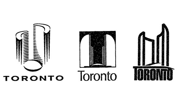
 The City of Toronto's ubiquitous logo adorns almost all official civic communications from planning notices to press releases. In it, a stylized outline of Toronto's political nexus is accompanied by an imposing bold face block of text. It's also the symbol the city uses on its road signs to welcome visitors to Ontario's capital.
The logo was selected by city council on May 14, 1998, to replace the six interlocked rings of the soon-to-be-defunct Metro Toronto. Three possible choices, shown above, were presented to council for consideration by a team of graphic design professionals hired by city staff.
Naturally, not everyone liked the choices. Then-councillor Michael Prue refused to vote on any of the logos because they focused on the centre of local government rather than the city itself. "This is absolutely the wrong thing to do. We need something brand new that includes all of us."
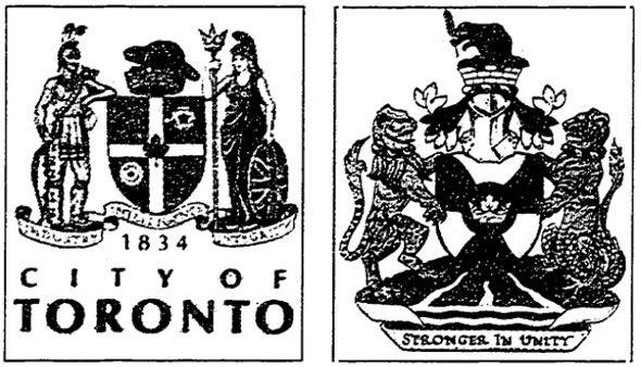
Coun. Chris Korwin-Kuczinski suggested holding a public competition similar to the one that produced the city flag in 1974. Coun. Howard Moscoe didn't have as much faith in local talent. "When I want to put in a bathroom I hire a plumber and when I want to write a bylaw I hire a lawyer ... and I don't use amateurs to do that kind of stuff," he told the Star. The city also took the chance to make changes to the official crest, dropping Britannia, a female personification of Great Britain, and a native character in favour of a bear, beaver, and eagle. The alterations didn't pass council first time and the first draft (shown on the right above) was sent back for revisions during the same debate that approved the new logo.
The current coat of arms uses the motto "diversity our strength" and includes symbols of Etobicoke, Scarborough, and the three main rivers of the region: the Don, Humber, and Rouge. An eagle represents Toronto's native heritage above a T (for Toronto) that also matches the outline of city hall.
Which logo would you have chosen given the choice? The centre image was the City of Toronto logo prior to amalgamation. Would you have simply re-used the Metro logo and saved the cost of designing a new motif?
Chris Bateman is a staff writer at blogTO. Follow him on Twitter at @chrisbateman.
Image: City of Toronto Archives.