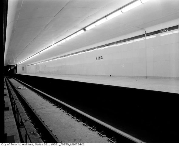
 Since its opening in 1952, numerous renovations and adaptions have altered the look of the Yonge line between Eglinton and Union. Gone is the uniform TTC font and original Vitriolite tiles - the reflective glass wall panels the system shared with the Woolworth Building in New York - and in their place is a mish-mash of typefaces and tiling jobs that give the stretch a strangely disconnected look.
Eglinton Station is the only one of the original 12 stops that has largely retained its original aesthetic. All the other stops south have had their tiles partially or entirely replaced with lime green (Dundas) and brown (King) textured wall decorations. At Queen and other stations the original TTC font has been ditched for a tightly-spaced version.
 Photographs and concept drawings in the City of Toronto Archives show the stations as they were originally intended: minimalist, utilitarian, and clean. The "bathroom modern" look, as it was derisively known, would be repeated in a slightly altered fashion on the Bloor-Danforth line a decade or so later.
Here are pictures of the original styling taken just before the line opened to the public.


Chris Bateman is a staff writer at blogTO. Follow him on Twitter at @chrisbateman.
Photos: City of Toronto Archives